How to make AI art
An experiment in journalism illustration
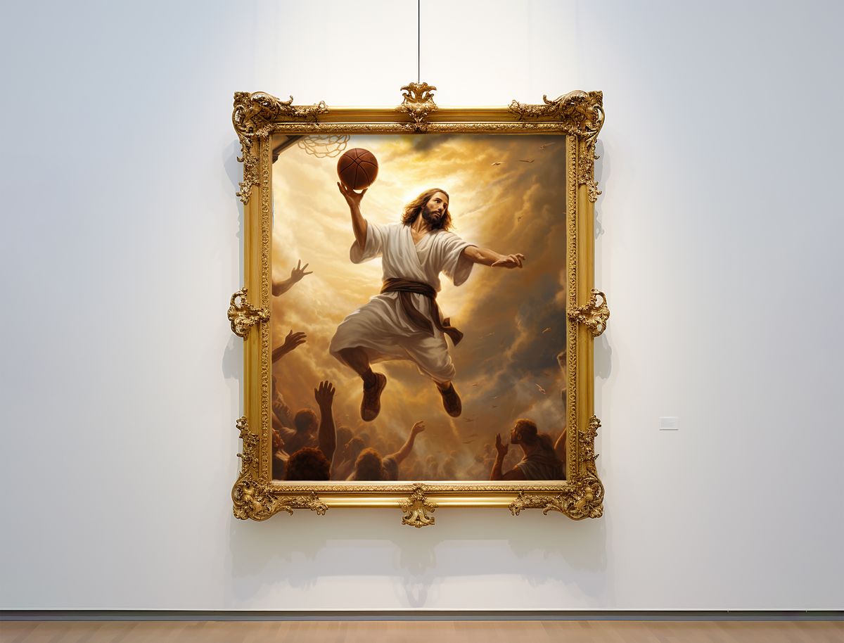
For CJR’s business model issue, we decided to experiment with incorporating machine-generated art into our process for creating illustrations. We started with the basic approach: visit a website, type a few words or phrases into a form, press a button, and watch as the screen refreshes and displays images based on the prompt. It’s magic, sort of. Using these generative systems proved to be simple (hooray for accessibility!), but in art, simplicity can be as limiting as it is advantageous. Producing an image of Jesus dunking a basketball is easy; getting the right image of Jesus dunking a basketball is much harder.
Each of the major generative-art tools — DALL-E, Dream Studio/Stable Diffusion, Midjourney — offers ways to guide the machine. You can change a text prompt slightly to alter a composition (“pencil sketch” or “in the style of van Gogh” or “Jesus facing right as he dunks”). You can tell a system to create variations of a proffered result, not unlike an editor saying, “This idea is good, but it needs some work.” Some systems allow you to upload source images or enter negative prompts (“no clouds”).
Fiddling only takes you so far, though. One scene may be so remarkably crafted that it takes your breath away; another looks like the computer started its homework while the teacher was already coming down the row to collect it. Arms might be perfectly muscled and shaded — or emerging grotesquely from the head of a whale.
There is also the problem of us. These machines are built on libraries of images created by humans. Just like sentences from ChatGPT, any picture presented by a generative-art tool is a pastiche of previous work, which means the output contains all the biases of the inputs. Enter “podcaster” in your text prompt without any race or gender descriptors and the major systems will show you a schlubby white dude with a beard. Enter “scientist” and they’ll show you an old white dude in a lab coat. Enter “journalist” and they’ll show you a middle-aged white dude in a suit. (Some of the images feel doubly wrong: not only are they stereotypes, they’re comically outdated.) There are ways to work around the racism and sexism encoded here—typing “young female scientist” produces appropriate results—but the defaults of these systems pose serious pitfalls.
In other words, to call these systems “artificial intelligence” would be to mislabel them; in reality, they are internet-fueled tools that require practice and expertise. And time: after pressing the “generate” button, it usually takes a minute or two for results to be revealed — not so bad considering what is happening behind the scenes (these machines demand incredible computational power), but when it sometimes takes a dozen attempts to get a desired result, the time adds up. While you wait, you might see a spinner or a progress bar. Or, if you’re using Midjourney, you begin with a blurry version of the image, then detail is added gradually before your eyes, like a modern-day Polaroid.
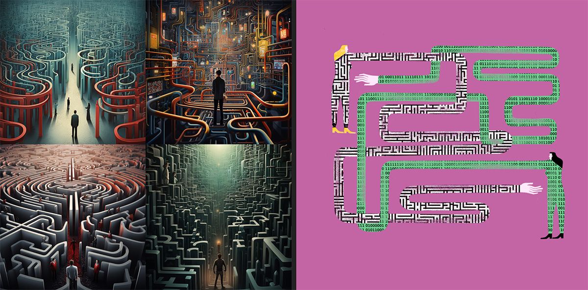
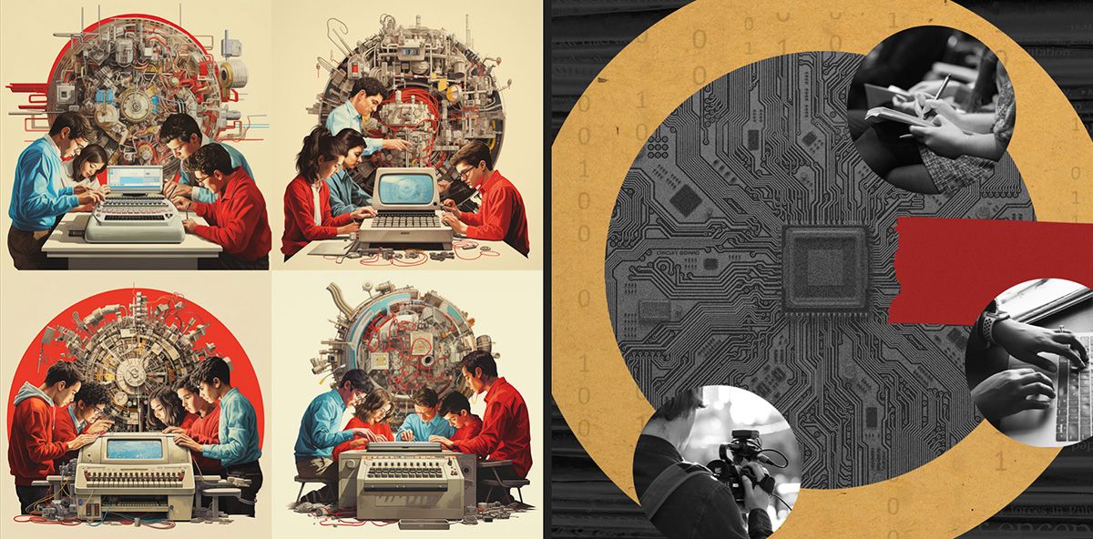
In the course of developing art for this issue, we found that generators couldn’t produce final art—beyond the problems outlined above, there are copyright complications—but we found them incredibly useful in brainstorming. At first, our process was the same as always: I spoke with an editor about each of the stories. We talked about the message we wanted our art to convey. But before I took that direction to professional illustrators, I opened Midjourney and produced dozens of possible images for each article. The editor and I were able to scroll through those images and talk about what was and wasn’t working—making observations we would likely have missed in a strictly verbal conversation.
Our machine-generated visual aids also simplified the process for the illustrators we hired. As ever, we offered them textual guidance, but this time we also provided several machine-generated reference images. We told the artists that they could hew as closely to those images as they wanted, or try something else entirely. (They’d get paid their regular rate either way.) Below, you’ll see the starting and ending place for some illustrations in this issue.